Audiences remember what moves them, and nothing imprints faster than a powerful use of color.
Bold, saturated palettes take the lead in shaping emotion, setting tone, and defining visual identity. Across cinema, television, and advertising, the strongest stories use hue as a narrative tool that speaks before a single word is heard.
Filmmakers who master color create a signature that makes their work unmistakable.
Bold Colors in Film
In film, bold color transforms the frame into a stage where emotion, tone, and story are performed in pure visual language.
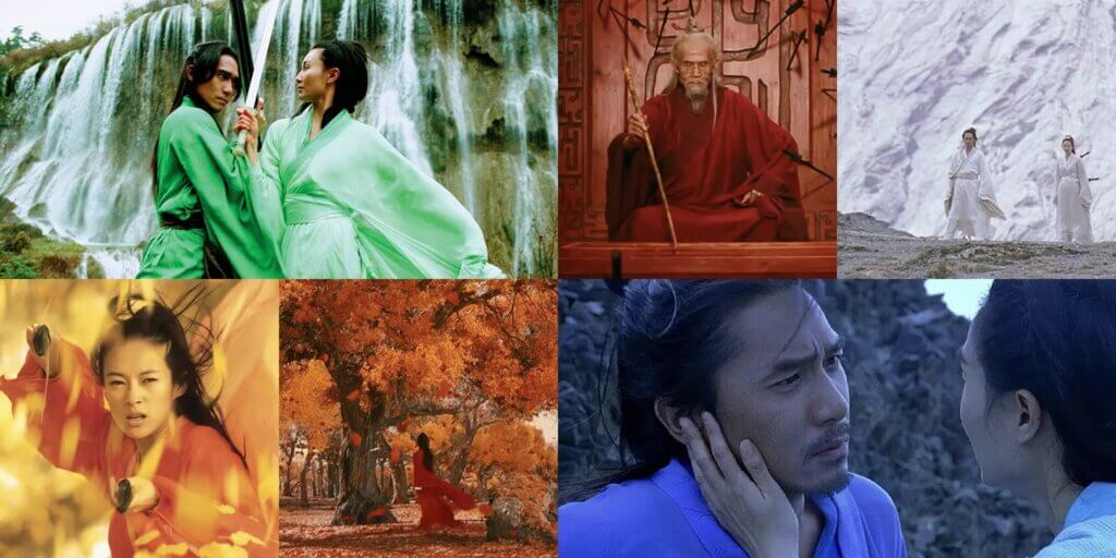
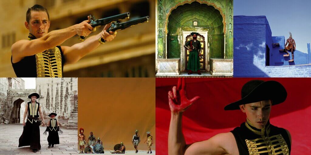
Hero
Zhang Yimou’s Hero turns color into a full-fledged storytelling language.
Each chapter of the film lives in its own world of color—red for passion and violence, gold for honor and sacrifice, jade for peace and resolution.
RELATED READS: How Analog Storytelling Is Rapidly Becoming the Most Effective Use of Visual Language
These palettes signal perspective shifts, emotional beats, and changes in narrative truth. The precision of this approach makes the audience feel the story before they process it, proving that bold color can carry as much narrative weight as dialogue or performance.
The Fall
Tarsem Singh’s The Fall transforms the screen into a gallery of living paintings. Shot in over 20 countries, the film uses saturated blues, radiant oranges, and lush greens to create a visual world that feels entirely separate from reality.
Costumes explode with color against natural landscapes, pushing every scene toward the mythic. This heightened palette amplifies the fairytale’s sense of wonder and deepens the emotional connection to its characters.
The imagery lingers because it’s both beautiful and inseparable from the story’s emotional core.
The Grand Budapest Hotel
Wes Anderson’s The Grand Budapest Hotel is a masterclass in color orchestration. Pastel pinks, buttery yellows, and powder blues create a visual rhythm, punctuated by bursts of rich red and deep violet that mark moments of tension or change.
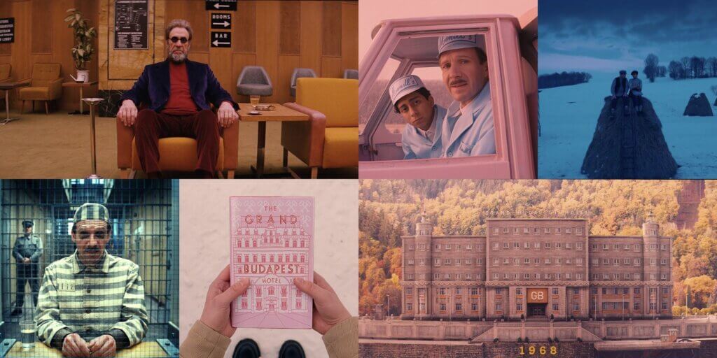
Every set, costume, and prop is designed with harmony in mind, creating a visual signature that’s instantly recognizable. The palette defines the tone, pacing, and mood of the entire film.
RELATED READS: Editor Andrew Weisblum on “The French Dispatch”
Bold Colors in Television
On television, saturated palettes create entire worlds that feel instantly alive and emotionally charged.
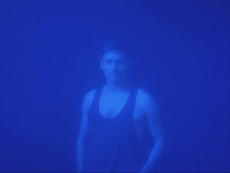
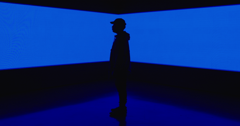
Euphoria
HBO’s Euphoria pushes television lighting into cinematic territory. Its color story is a sensory extension of its characters’ emotional lives.
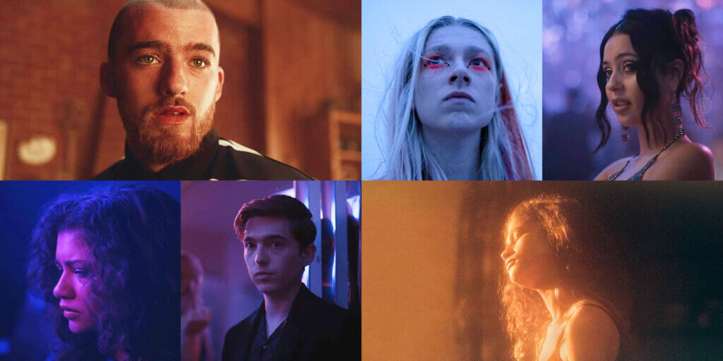
Deep purples wash over moments of introspection, electric blues electrify scenes of heightened anxiety, and blazing oranges punctuate moments of passion or danger.
The use of gels, LED washes, and production design creates a world where the audience experiences emotion as light and color.
RELATED READS: How Filmsupply Gave HBO Max’s “On the Roam” a Gritty, Cinematic Texture
Squid Game
Squid Game makes its candy-bright palette impossible to forget. Mint-green tracksuits, hot-pink guard uniforms, and primary-colored playground sets create an energy that is both playful and unnerving.
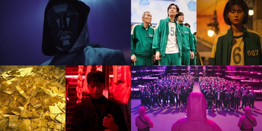
These saturated colors dominate the frame, acting as a constant visual reminder of the game’s deceptive surface and the stakes beneath it.
The palette brands the series instantly, turning visual design into part of its cultural identity.
RELATED READS: Understanding the Basics of Cinematic Color Grading
Twin Peaks
Twin Peaks builds an atmosphere of mystery and unease through its deliberate use of saturated color.
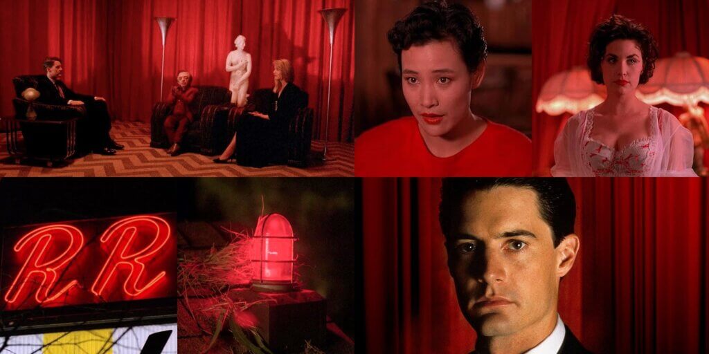
The deep, velvety reds of the Black Lodge curtains, the glow of cherry pie in the Double R Diner, and the green of the surrounding forests create a tonal palette that’s both surreal and grounded.
These colors repeat throughout the series, building a visual mythology that fans recall instantly.
Bold Colors in Advertising
In advertising, bold color becomes a brand’s heartbeat, making every frame unforgettable and instantly recognizable.
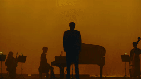
Apple — “Someday” by Spike Jonze
In Someday, Pedro Pascal moves through a muted, wintry city, broken by the apparent end of a romantic relationship. It isn’t until a single gesture—activating noise cancellation on his AirPods—that the world begins to flood with color, life, and hope.
Streets shift from dull greys and cold blues to vibrant reds and oranges. Seasons change in seconds, and music drives a seamless dance through blocks of saturated color.
Each transformation is choreographed as much through hue as through movement, turning a product demonstration into an emotional arc. The film shows how color can signal renewal and hope, leaving viewers with a visual memory as strong as the story itself.
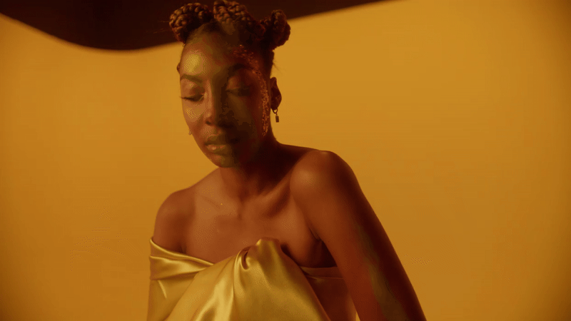
Gap — “Meet Me in the Gap”
Gap’s Meet Me in the Gap campaign from 2018 turned a color-blocked set into a kinetic art piece.
Inside a massive spinning cylinder, twelve dancers performed in perfect unison, creating a hypnotic loop of movement and hue.
The in-camera approach gave every frame a tactile authenticity, with bold spring colors framing the performers and clothing as one seamless composition.
The choreography of light, fabric, and saturation made the collection—and the brand—impossible to forget.
Jaguar — Copy Nothing
Jaguar’s Copy Nothing campaign redefines the brand through pure visual audacity. Hyper-saturated tones drench surreal, otherworldly landscapes, where models in vivid, high-fashion styling move through scenes untouched by automotive convention.
The absence of cars turns color and composition into the true focal points, making the palette itself a statement of identity. Every frame rejects the ordinary, positioning Jaguar as a brand fluent in the language of bold design.
RELATED READS: Worldbuilding, the Apocalypse, and Star Wars: How Visionary Filmmakers Set the Stage for “Carry Us”
Why This Matters for Filmmakers
Bold, saturated color commands attention and leaves a lasting imprint. It communicates intention, confidence, and creative clarity.
A filmmaker’s palette becomes part of their signature, guiding the audience’s emotional response before the first line is spoken, establishing a distinct identity in an instant, and transforming a single frame.
It tells the audience how to feel before a single word is spoken. It can define a brand in an instant or etch a scene into cultural memory forever.
License Footage with Bold, Rich Color
You can license fully released footage from our color-specific collections — only on Filmsupply.
.gif)