Throughout the post-production process, there are many different steps. From the actual editing of the film to the sound design and visual effects, each stage matters. One of these important stages is color grading. As highlighted in one of our other articles, color grading is one of 17 professional skills and techniques every video editor should master. Read on to learn more about cinematic color grading, why it’s important, and how you can emulate the professional colorists of big budget blockbusters.
What is cinematic color grading?
Cinematic color grading is the process of enhancing and altering the color of footage in order to achieve a desired visual effect. In short, colors illicit emotions – they have a psychological impact on the audience. This artistic skill helps curate a film’s color palette which in turn conveys specific atmosphere, style and emotion. As Jet Omoshebi perfectly framed it, the role of a colorist is acting as “a translator between the filmmakers and their audience — to make sure no message is lost.”
Let’s take a look at a few examples below.
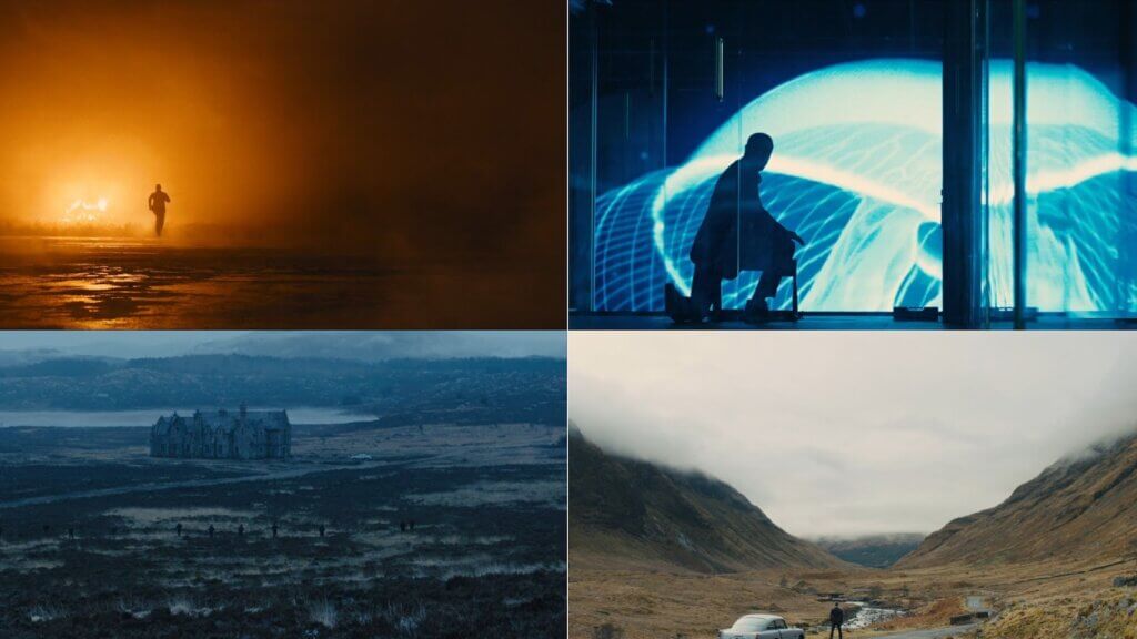
Denis Villeneuve’s Blade Runner 2049 (2017)
Throughout the film, different colors convey key messages. Whenever the main protagonist (K, played by Ryan Gosling) passes through a key plot point or twist, the color grade is overwhelmingly yellow, conveying information and enlightenment. The whole of the Wallace Headquarters scene is yellow, subconsciously signaling that this is an important place with key information, inhabited by important people.
Wes Anderson’s The Grand Budapest Hotel (2014)
Wes Anderson’s color grades have become a signature of his unique aesthetic style. With each of his films there’s a real sense that they are works of art, none more so than The Grand Budapest Hotel. His use of vibrant reds, purples, pinks, whites, oranges, yellow and browns throughout the hotel (particularly during the 1932 timeline scenes) convey the hotel in all its fantastical glory. There’s an element of eccentricity in the grade which matches the quirky, whacky story. Did you know, he also used huge matte paintings for some of his set designs?
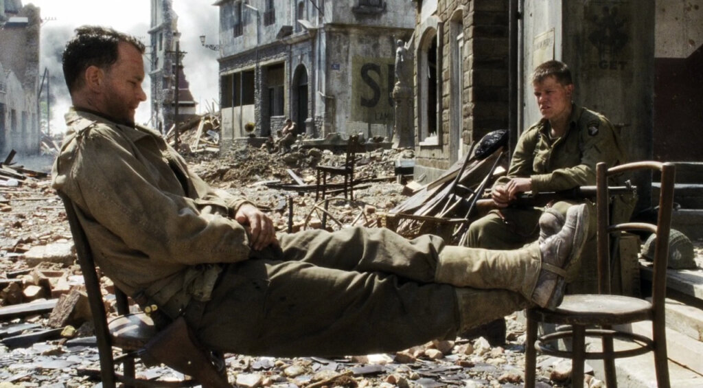
Steven Spielberg’s Saving Private Ryan (1998)
War is a brutal, bleak thing and the color grade of Saving Private Ryan reflects that. The color grade is desaturated, conveying two key messages. The first is that Europe during WWII was a bleak, miserable place – it’s cold, it’s lifeless, it’s tough. The second is that this desaturated look makes the film feel older. When the audience watches, they feel like they’ve taken a step back in time, to the period of the war itself. This color grade would’ve been found in plenty of photos of the day – a “washed out” feel with muted colors. The impact of the deep red blood on our screens is really strong when set against this muted palette.
WARNING: The following clip is of a violent nature
Color grading vs color correction
It’s very common for color grading and color correction to get mixed up. While color grading is the process described above – enhancing and altering the color of footage to achieve a desired visual effect – color correction is different.
Color correction is the step before grading. With color correction, colorists are adjusting color, contrast and exposure so that footage appears as natural and unprocessed as possible – the way our eyes experience scenes in real life. This provides the foundation on which a color grade can then be applied.
Should you color correct before color grading?
In short, yes. If you want to achieve the best color grade possible, color correction is essential. It gives you a consistant, neutral canvas on which you can apply your grade. If your pieces of footage all look different, it will be much harder to achieve a uniform, cohesive grade throughout.
Is color grading necessary?
If you want your film to evoke real emotion and convey the message your story is trying to tell, then color grading is essential. Take the series Better Call Saul as a fantastic example.
The color grade for this series works so well because of its lack of color. The black and white flashforwards work on multiple levels. First, they differentiate the timelines between pre- and post-Breaking Bad. But they also reflect Jimmy/Saul/Gene’s current life. The lack of color shows that this life is bleak and boring – a shadow of what it once was.
What I found most beautiful about this color grade is when the color pops back into this timeline. When Gene sees his old Better Call Saul commercials, the reflection in his glasses is colored. This signals his yearning for his old life, when he was thriving and powerful.

The next time we see color, it’s when Jimmy is behind bars. As he lights a cigarette with his love interest Kim, we see the flame in color. It’s a symbol of how she has brought light and color back into his mundane life. There is still a flame alive between them. Without this use of color, these two scenes would have nowhere near the same impact.
Types of color grading in film
There are lots of different types of color grades and color pallettes. These are some of the most common.
Teal and Orange – the blockbuster look
One of the most common cinematic color grades is the “teal and orange” that you’ll find in many blockbusters. Because these colors are opposites, they look good together and contrast well. Blues and teals are for shadows, while oranges and yellows are highlights. Quite often, skin tones are more orange, so they stand out against blue shadows, drawing attention to subjects.
Skyfall (2015)
Monochromes – dominant color grades
Monochromes are built around tones, working with saturation to create very striking images with dominant primary colors. Cinematographers use these dominant colors to convey key messages, as already discussed with Blade Runner 2049. There are plenty of other great examples out there.
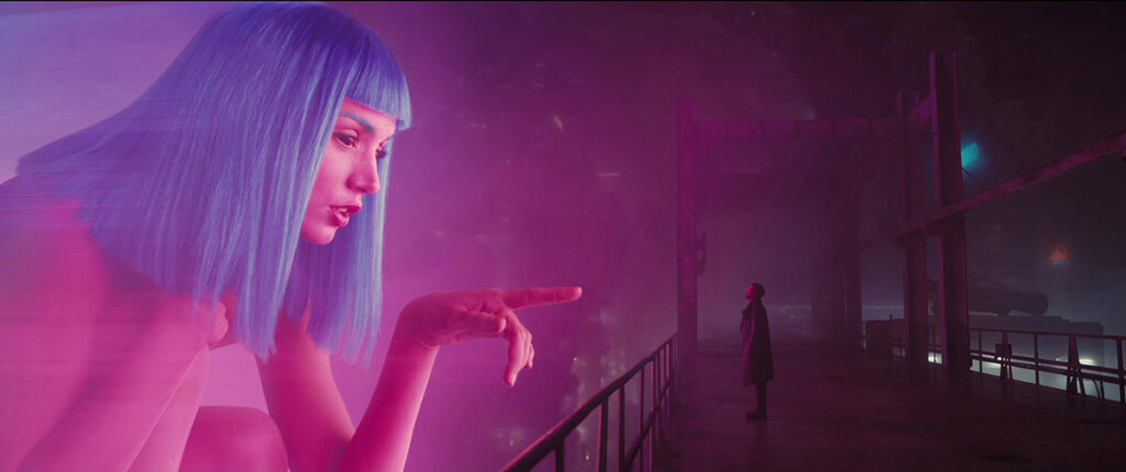
Blade Runner 2049 (2017)
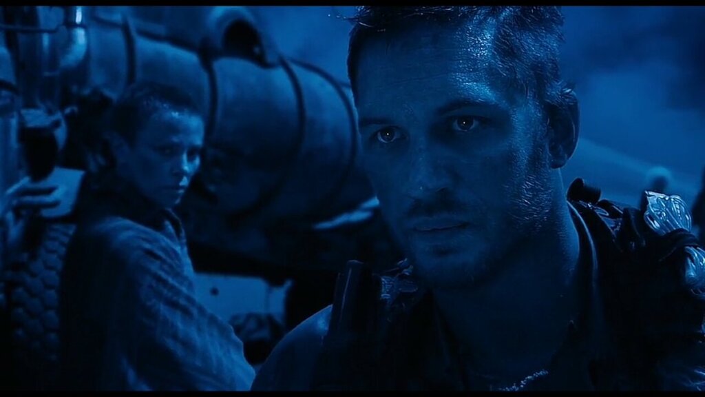
Mad Max: Fury Road (2015)

The Matrix (1999)
Bleach Bypass – a desaturated look
In direct contrast to monochromes, the bleach bypass color grade is very desaturated. It’s often used to reflect desperate, hopeless worlds and stories.
Saving Private Ryan (1998)

Terminator Salvation (2008)
Black and White – timeless and classic
There was a time when Hollywood had no choice. Every film was black and white. Then came color and seemingly, nobody ever looked back. However, in recent years black and white seems to be on the comeback trail. It’s about playing with tone, contrast and dynamic range.
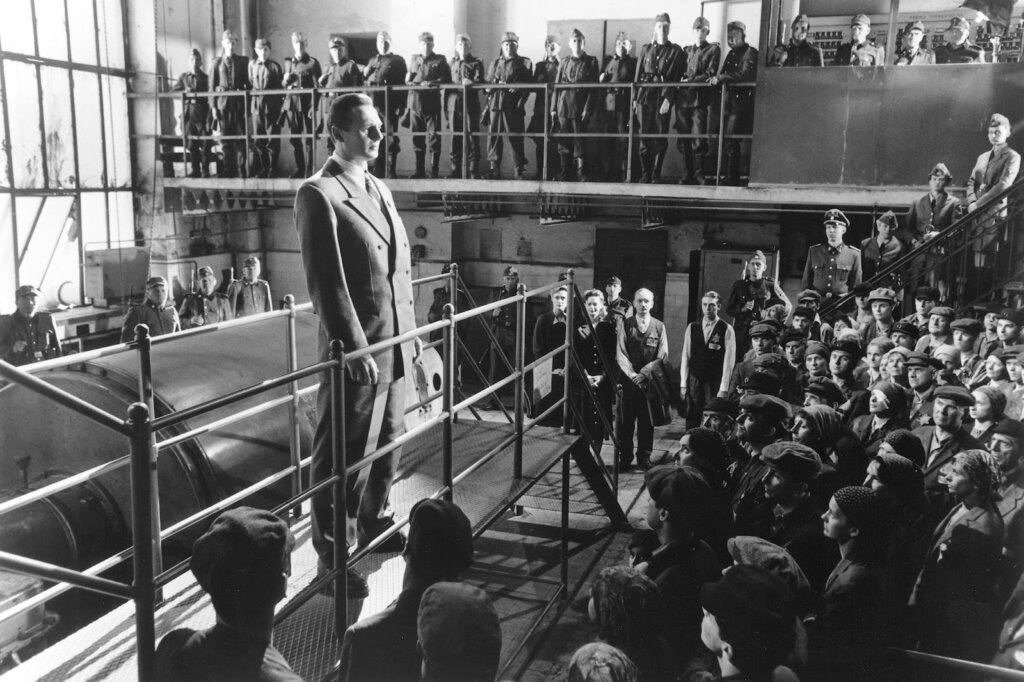
Schindler’s List (1993)
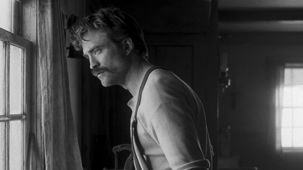
The Lighthouse (2019)
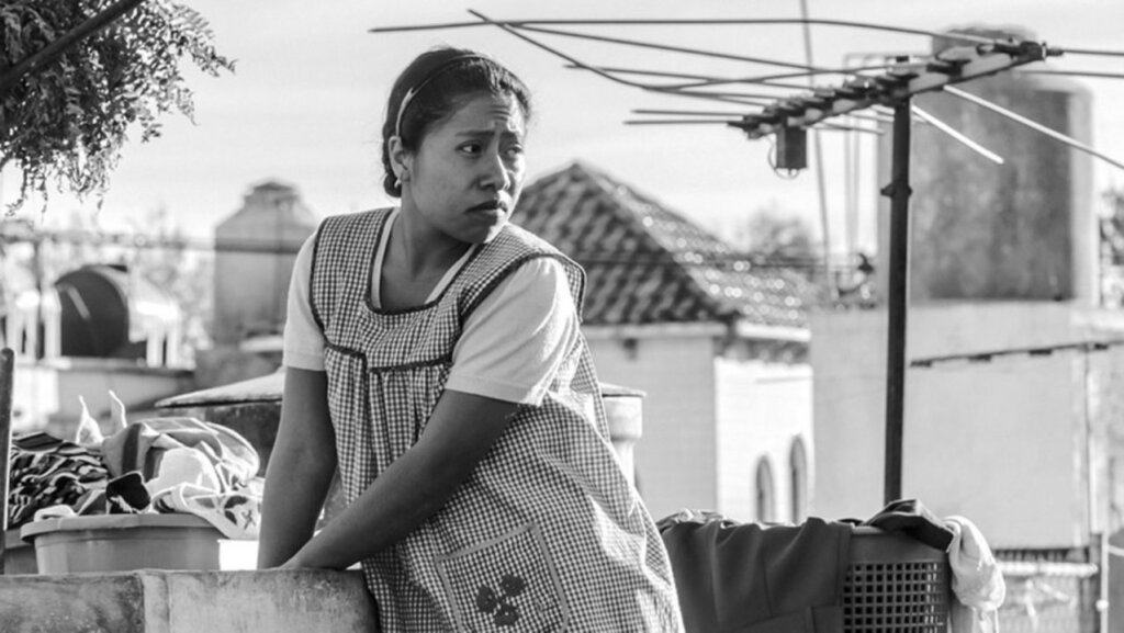
Roma (2018)
Color grading steps
There are a few steps to the usual color grading process.
Shoot in RAW/LOG
Before you grade, you should try to shoot your footage in a RAW or LOG format. This will help keep the image profile very flat, making it easier to work with. You can also find plenty of RAW and LOG footage on Filmsupply, provided directly from our roster of filmmakers.
Color correction
Adjust color, contrast and exposure so that the footage appears as natural and unprocessed as possible, ready for grading.
Primary Color Grade
Primary color grading adjusts color for the entire image. You usually do this first.
Secondary Color Grade
Secondary color correction involves isolating specific parts of the image, or objects within the video frame, and grading only those.
LUTs
LUTs (look-up tables) can be a great, simple way to achieve a consistent look throughout, particularly when it comes to skintones. Rather than grading each individual scene, a LUT can be applied to a whole film within seconds.
Color grading tips
White balance
To help with color grading, we always recommend white balancing each of your scenes before you shoot. If you let a camera auto white balance, there’s a chance the temperatures may be way off between different clips, creating more work for yourself when color correcting and grading.
Underexposed footage
Shooting slightly underexposed is always going to help. You can always increase the exposure of this footage, but an overexposed image with blown-out highlights is irretrievable.
Noise correction
Unwanted noise can be cleaned up with various post-production software but it’s best to avoid it by shooting in good lighting at a lower ISO. Unless, of course, you’re purposefully going for a “grainy” style.
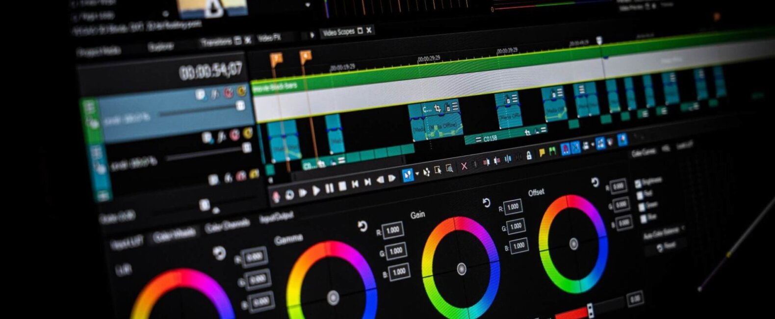
Software for color grading
There’s plenty of color grading software out there. Some of the most popular options are DaVinci Resolve, Blender and Premiere Pro (Lumetri). All of these contain the following essential tools:
Color Wheel
Color wheels allow you to make color adjustments to specific areas of the image – midtones, shadows, and highlights.
Tone curves
Tone curves allow you to adjust brightness and contrast. A classic “S curve” would mean brightening highlights and darkening shadows, increasing the contrast.
Hue & Saturation slider
Hue is when you choose the color itself, while saturation is how intense that color is.
LUTs
LUTs are a preset template that you can apply to your footage to grade it quickly and efficiently.
Waveform
A waveform shows you the dynamic range of an image, allowing you to correctly set the “black and white points” or in other words, making sure your highlights aren’t blown out and your shadows aren’t “crushed”.
Histogram
Histograms help ensure your exposure is correct.
Vectorscope
Vectorscopes use a polar coordinate system to display hue and saturation measurements. The further out from the center of the color palette, the more intense the color
Hardware for color grading
Your monitor is the most important hardware to consider when color grading. You’re looking for a screen that can display a wide color gamut with good color accuracy, viewing angles and high resolution. Ideally, it should support hardware calibration so that you can fine tune the accuracy of your colors.
You can also get more specific, purchasing editing consoles and color panels. A color panel can drastically speed up the process of color grading. With dedicated buttons, dials and wheels, you quickly develop muscle memory that allows you to grade far faster than when using a traditional keyboard and mouse. It’s much more intuitive and precise, too.
Wrapping up
So, that’s everything you need to know about the basics of color grading. From what it is to why it’s important and some of our most essential color grading tips and steps, you’re now a master of a visual language that can enable you to to start conveying key messages and emotions throughout your work.
Photo by Nejc Soklič on Unsplash