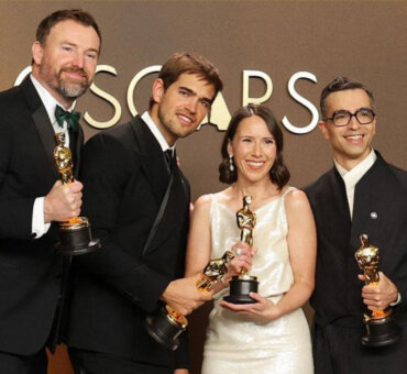
The submissions are in, the votes are counted, and the wait is officially over. We’re proud to introduce the winners of the Summer 2026 edition of Filmsupply Editfest.
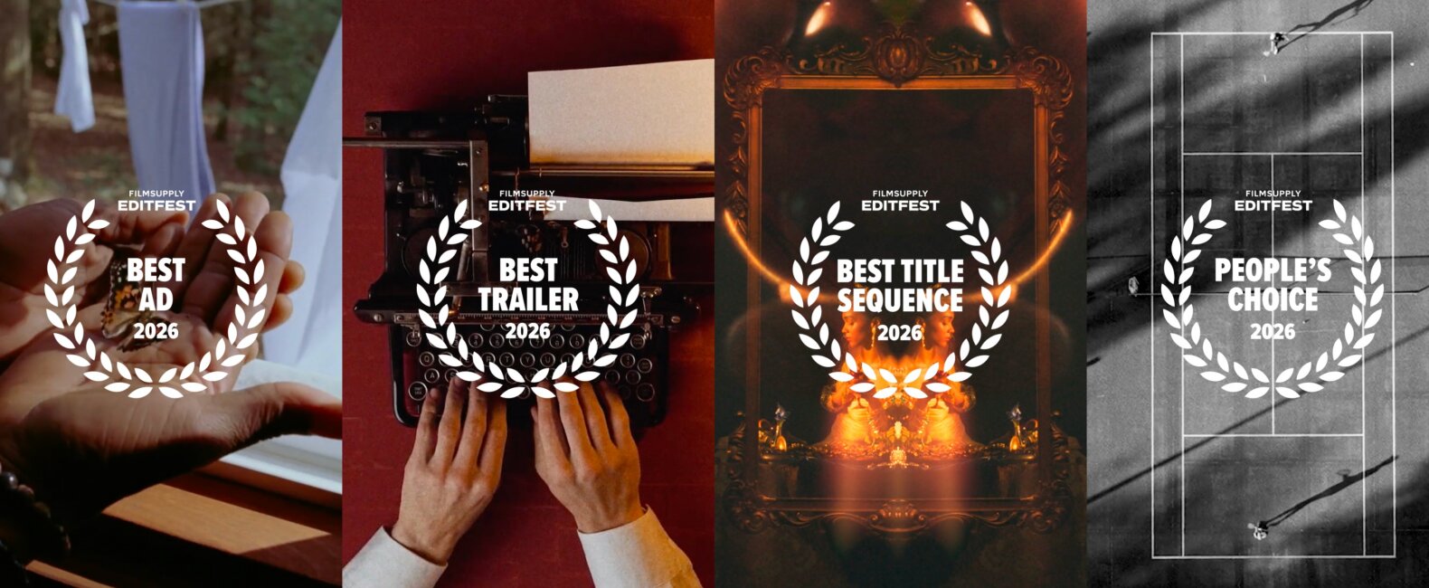
From standout storytelling to masterful technique, let’s celebrate the Best Advertisement, Best Trailer, Best Title Sequence, and People’s Choice and congratulate the filmmakers taking home their share of $65K+ in cash and prizes.
FILMSUPPLY EDITFEST SUMMER 2026 WINNERS
BEST ADVERTISEMENT: “An Elephant Never Forgets”
CREDITS
Script and Editing: DALVA (@dalva.cc), Karen De Vasoncellos Lima Pompeo (@karenpompeo), Rawi Santos (@rawisantos)
Sound Design: Rafael Simões (@osomdorafa)
JUDGES’ FEEDBACK
Rebeca Prieto, Digital Asset Manager at Monks | Google, Meta, General Motors
Great advertisement overall! It kept me guessing about the subject matter right up until the punchline at the end; when it was revealed to be for cloud storage, I had a total ‘AHA!’ moment. The color grading was remarkably consistent and the pacing of the montage was great. While some of the clip choices did feel a bit like stock footage, given the nature of the cloud storage service being advertised, it actually feel like they’re a great fit. To top it off, the piece featured a great script and an excellent choice of voiceover.
Jordan Wright, Producer at Untold Studios | Amazon Music, Netflix, BMW, Google
This was a great piece, the opening is masterful. Edit skills are on full display here, the cut and sound design works well together and the pacing is excellent. I don’t have any criticism for this piece. It was beautiful, well executed, and thoughtful.
Aubrey Zych, Creative Director at Guild | Hubspot, Guild, Classpass, Team USA
This is one of the strongest concepts I’ve seen so far. The “an elephant never forgets” idea is a really smart and ownable way into the brand. It takes a product that could feel fairly functional or mundane, a cloud sharing platform, and gives it a story that feels emotional, memorable, and specific to ElephantCloud. This is a concept that could only be told by this brand, which is a grand slam for an effective advertisement.
The concept and script are particularly powerful and attention-grabbing. The story of elephants, paired with seemingly unrelated footage of memories, guidance, loved ones, and the things we carry with us over time, gives the piece a strong emotional foundation. It makes the product benefit feel bigger than file storage. Throughout, I almost kept waiting for a visual of an elephant to show up to align with the script, and it was a powerful payoff that the first time you do see one is the logo. It’s an extremely memorable concept and clever execution.
Where I would push the piece is ensuring the footage choices are ruthlessly aligned to the idea. Initially, it took me a few watches to fully understand the concept.
Once I understood the idea, I could see that many of the clips were meant to represent memories: childhood moments, family milestones, graduations, fishing with a grandparent, and other everyday moments someone would want to save and revisit. Those choices are really strong when they feel intimate, human, and emotionally specific, almost like home movies or clips pulled from someone’s own camera roll that they’d want to back up on the cloud platform.
There were a few visual choices that pulled me out of that interpretation and made the story harder to follow on the first few watches. For example, the shot outside the car, the wellness / massage room, and the ceiling fan / daylight on the man were moments where I had to work harder to understand what I was looking at, and then ultimately what kind of memory is being depicted. These shots muddied my understanding on the first few watches of what was otherwise a really clever concept.
There were a few other moments when the shot angle also made me lose track of the core concept. For example, in the kissing montage, the more imperfect, home movie, or selfie-like moments worked beautifully because they felt personal and real. The more distant or composed angles, like the shots from the top of the stairwell, felt more distant or like scenes from a narrative film. While those shots are beautiful and work well rhythmically in the edit, they slightly muddied my understanding of the core narrative about memories because they felt like they were observed from the outside by someone else.
Technically, I thought the edit, sound design, pacing, and overall stylistic approach were excellent. The piece has a strong emotional tone and a clear sense of craft.
Overall, this is a standout concept and one of the most ownable ideas I’ve seen. With a tighter, more intentional approach to footage selection, I think this could be an exceptional ad. Great work!
ADVERTISEMENT FINALISTS
BEST TRAILER: “47 SECONDS (Or: The Final Report of the Department of Lunar Verification)”
CREDITS
Filmmaker: jackcat (@jckcat_)
JUDGES’ FEEDBACK
Daniel Lloyd, Broadcast & Video at Dell Technologies | Dell, Nissan, Sony, Zach Theatre
Excellent trailer. Pacing was tight, cuts were fast at times, but shots chosen were strong enough not to lose coherence with the fast cuts. Great way to establish the feeling of the trailer and the world in the first few seconds (date -> time). An alternative universe is on display and audiences would eat it up. It’s a mystery, but beyond the astronauts being late, and the general mystery of the moon, I don’t have a lot of character to hang my hat on.
The employee did not have a name and his disappearance feels less important because of it. The astronauts are faceless. I watch the trailer and I know what is happening, and we’re going to find out why, but I don’t know with whom. Hence, I scored lower on emotional hooks. BUT, overall there was a lot of creativity on display, and a tight, well-paced and stylized edit. Well done!
Christine Wolf, Editor at Pircture North | Ford, Guinness, Disney, YouTube
The concept is really unique, clever, and engaging. I wanted to know more and did not want it to end. The use of footage was also very cohesive and creative. The visual thread with the graphics, color correction, VFX, and look was top-notch. Technical skills overall were also very sharp and strong. Great use of sound design, fast cuts, music, and voice over. Where it fell a little short was the storytelling and arc of the trailer. It felt more like a short film and less like a trailer. There was no emotional engagement at all, but despite that, it was still really great, and I enjoyed it. I think the execution was very impressive and one of the best.
Cami Starkman, Editor at Nomad | Amazon, Calvin Klein, Puma, HBO
The retro film look, pacing, and sound design grabbed me. It had a clear point of view and style from start to finish. Very cohesive and playful at the same time.
TRAILER FINALISTS
BEST TITLE SEQUENCE: “OBVERSE”
CREDITS
Filmmaker: André Kosasih
JUDGES’ FEEDBACK
Kylie Scott, Senior Producer at Criminal TV | Salesforce, Slack, Okta, Servicenow
Fantastic. Storyline was clear, editorial choices were top-notch – both contributing to the style and emotional draw. Color work was smart and consistent, and again contributed strongly to the storyline. Visual effects were well utilized and well executed. Music choice was smart and sound design was strong. Fantastic piece.
Graham Patterson, Editor at Modern Post | Dior, Meta, adidas, Dua Lipa
OK, so normally I’m not a fan of mirrored footage, but you really figured out how to own it here, so kudos to you! The graphics felt clean and considered with the imagery, which I haven’t seen in other submissions yet, so kudos to you again. I also am normally put off by overly overlayed treatments, but you found a way to make it graphic, considered, and intentional.
There was some footage that stuck out to me as not being totally visually consistent – you’ve done such a good job creating a consistent visual treatment with footage that all feels like it belongs together, then at :18 I get that kind of molecular feeling shot and it just stands out as not of the same world as everything else, but then the shot after that I’m like, ok lovee that. The shot at :24, it’s cool but again it feels like an outlier visually. Shot at :31, not huge on that, doesn’t feel like jiving visuals and overlays, :31 and :32, not loving, but then back to loving at :33. :43 to :53 feels pretty weak to me, but then it finishes strongly after that.
Overall, I think it’s about taking those moments that are really working, and making sure that the footage you’re using, the treatments, the consideration, is at its strongest consistently – once you do that you have a really strong title sequence.
Samantha Waite, Producer at Edelman | Dove, Vaseline, Barilla, Lipton
This was a strong submission overall with a lot of solid creative choices. The pacing worked well and kept the sequence moving at a steady rhythm, making it easy to stay engaged from beginning to end.
Emotion (7/10): The piece was engaging and maintained a consistent tone throughout. While it didn’t create a particularly strong emotional response for me, it held my interest and supported the overall mood effectively.
Storytelling (7/10): The storyline was generally clear and easy to follow. The sequence communicated its ideas well, though there were opportunities to make the narrative even more impactful and memorable.
Concept / Originality (7/10): The concept felt thoughtful and well executed. While it didn’t feel especially groundbreaking, it was creative enough to stand out and was supported by strong visual choices.
Technical Skills (7/10): The technical execution was solid across the board. I especially liked the use of two different colors in the titles, which helped create visual interest and added personality to the design. The pacing was one of the strongest technical elements for me, as it felt controlled and intentional throughout.
My main critique is that the music didn’t always feel fully aligned with the visuals. While neither element was weak on its own, I felt a stronger connection between the soundtrack and the imagery could have elevated the overall impact of the sequence.
Overall, this was a well-crafted entry with strong pacing, thoughtful design choices, and a clear creative vision.
TITLE SEQUENCE FINALISTS
PEOPLE’S CHOICE: “Match Point”
CREDITS
Editor: Bianca Bissada (@biancabissada)
Voice Talent: Steve Puhach (@steve.puhach)
Special thanks: Nimiopere Film Editorial (@nimiopere)
JUDGES’ FEEDBACK
Eddie Kesler, Senior Editor/VP at Company 3 | Coca-Cola, Delta Airlines, Google, HP
love this one. probably my favorite. great shot choices and even better timing. didn’t feel rushed and had nice pacing of the vo but still had a lot of energy where it was needed. made the grayscale footage do what it was supposed to. excellent job!
Rebeca Prieto, Digital Asset Manager at Monks | Google, Meta, General Motors
Technically, this advertisement was good; the shot selection was excellent and the footage itself was visually striking. However, the edit tries too hard to force a deep, luxury feel, which unfortunately caused the piece to become slow, boring, and completely unengaging. The script lacked emotional weight and it was pretty confusing at times, additionally the storyline gets bogged down by random elements like thunder, rain, and dirt that don’t make thematic sense for a tennis brand. I would have loved to see this go in a completely different direction. Instead of forcing melodrama, the edit should have leaned into high-energy action, using those intense environmental elements to build a fast-paced, visceral momentum reminiscent of Challengers.
Jordan Wright, Producer at Untold Studios | Amazon Music, Netflix, BMW, Google
This piece picked a style and stuck to it, which worked well. Some repeated shots made me question whether the piece should have been cut down to avoid repetition. While visually striking, I didn’t find myself as compelled as I wanted to be while watching it. The stylistic choice was the strongest attribute.