Great title sequences set the tone, preview what you will experience, and get you in the mood for what you are about to see. Whether classic James Bond openers, a wild and crazy Austin Powers sequence, or a complex television opening like the Game of Thrones cityscape—an excellent title sequence is absolutely crucial.
The Power of Good Title Sequences
Although audiences aren’t always aware of it, title sequences establish expectations and create anticipation for what is to come. Well-crafted title sequences capture your attention and immerse you into the world of the film before it even begins. From the dramatic and flashy sequences of action films to the understated elegance of independent dramas, title sequences are powerful tools for filmmakers to convey the themes and style of their work.
For film editors, creating a compelling title sequence is an essential component of the post-production process. It is a creative opportunity to set the stage for the visual story and leave a lasting impression by finding a harmonious blend of form and content.
Title sequences have become an increasingly important part of filmmaking, with designers and editors striving to create stunning and unforgettable openings that captivate audiences. They can also have a direct impact on the bottom line. Since the introduction of movie titles into motion pictures, there has been a 10% overall increase in box-office receipts.
In this article, we explore the importance of good film title sequence design and provide tips on how to craft one that will captivate any audience.
The Evolution of Film Title Sequences
During the silent film era, title sequences were often rather basic, typically consisting of static cards with text that listed the cast and crew. These sequences were designed to efficiently relay important information to audiences. For example, the title sequence of the classic film, The Public Enemy (1931), superimposed text on a mostly static background for anywhere from one to five minutes. While this approach was practical, it lacked the creativity and visual impact that modern audiences have come to expect from a film’s opening credits.
As filmmaking evolved, so did title sequences. Studios began to see the opening credits as an opportunity to create a visual identity for their films and set the stage for the story to come. This could be seen in 1937 with The Last Gangster, where the title card had been replaced by a newspaper headline and the subsequent credits appeared on the newspaper.
That said, a simple title card is back in fashion and can be seen in television series such as Curb Your Enthusiasm. This is more for practicality, as TV shows often have a ‘cold open’ sequence before the credits, and streaming platforms want people to keep watching without being slowed down by opening credits.
Over time, modern technology has completely revolutionized title design, and regular visitors to the multiplex will be very familiar with the Marvel opening sequences. The introduction to Black Panther: Wakanda Forever (2022) took the standard format and transformed it into a tribute to the late Chadwick Boseman.
The Great Lettering Artists
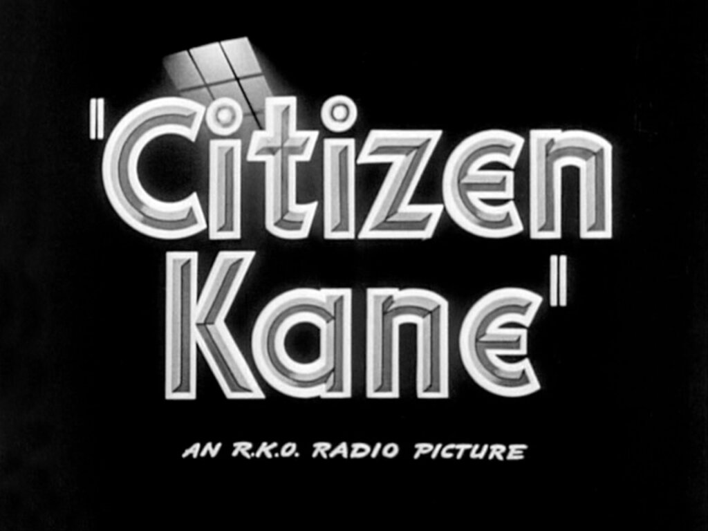
In the mid-20th century, lettering artists played an increasingly important role in film title sequences. One powerful example from the 1940s is the opening credits for Citizen Kane (1941), which combines typography, imagery, and sound to set the film’s tone. The sequence features striking visuals, including a close-up of a “No Trespassing” sign, and a shot of the main character, Charles Foster Kane, as a silhouette against a background of rolling clouds.
Bold typography and the film’s score into the sequence also helped establish the film’s tone and mood right from the start. Other classic films from the 1940s that featured memorable title sequences include The Maltese Falcon (1941) and The Big Sleep (1946), both using shadowy imagery and dramatic music to develop a sense of mystery.
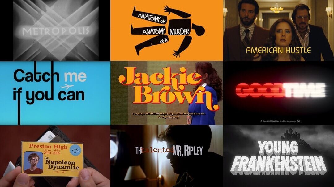
One of the most influential figures in this field was Pablo Ferro. Ferro’s style was characterized by a playful and irreverent sensibility, combining bold typography with hand-drawn illustrations. His work on Stanley Kubrick’s Dr. Strangelove (1964) is particularly notable, featuring animated sequences that satirize Cold War politics. Ferro also designed the opening credits for Bullitt (1968) and The Thomas Crown Affair (1968), using a now iconic split-screen effect and overlapping imagery to create dynamic and visually stunning sequences.
Ferro’s work established the importance of the title sequence to set the tone and mood of a film. In his opening of To Live and Die in L.A. (1985), we see a bright neon green and red palm tree. The red drips downwards, with the resonance of a gunshot and blood. The colors convey the glitz of Los Angeles and the dark underbelly revealed. Ferro also created memorable opening credits for films such as Men In Black (1997), Beetlejuice (1988), and Stop Making Sense (1984).
The Work of Saul Bass
Along with Pablo Ferro, Saul Bass is one of the most influential title sequence designers in film history. His work spans over four decades, during which he created more than fifty title sequences, including for The Man with the Golden Arm (1955) and Vertigo (1958). Bass’s typography and imagery were unique and innovative, and he introduced new techniques, such as kinetic typography, simple yet striking graphic elements, and visual metaphors.
Bass’s typography is aesthetically pleasing and functions as a visual storytelling tool. For example, in the opening titles of Vertigo, the letters of the film’s title seem to fall into an abyss, hinting at the themes of obsession and mental instability that the movie explores. Bass’s use of graphic elements, such as the spirals in Vertigo or the geometric shapes in Anatomy of a Murder (1959), contribute powerfully to the storytelling and the overall impact of the films.
Psycho
In addition to his innovative use of typography and graphic elements, Bass also created memorable opening credit sequences. His title sequences were integral components of the film and its story, establishing the film’s themes, characters, and atmosphere. One of his most famous works is the title sequence for Alfred Hitchcock’s Psycho (1960), widely considered a classic of the genre.
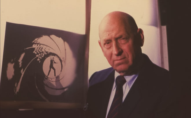
The Name’s Binder, Maurice Binder
If you have seen any classic James Bond films, then you know Maurice Binder’s contributions to film title design. His iconic work on the Bond franchise helped define the spy genre, and filmmakers have imitated his innovative techniques ever since. One of his most famous creations is the opening sequence of Goldfinger (1964), in which a woman’s gold-covered silhouette is projected onto a black background and accompanied by Shirley Bassey’s unforgettable theme song. Binder perfectly captures the glamorous and dangerous world of James Bond, establishing the tone for the entire franchise.
Here are some examples of Binder’s Bond titles:
Thunderball (1965)
Diamonds Are Forever (1971)
Live and Let Die (1973)
Key Components of a Great Title Sequence
A great movie title sequence sets the film’s tone and captivates the audience from the start. To create a professional and engaging title sequence, font selection and customization are essential. Visual interest is also key, and incorporating animation or illustrations can enhance the overall effect.
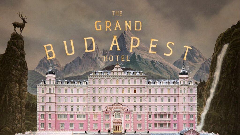
Typography plays a crucial role in conveying the story, and overall tone and feeling of a film. Effective use of typeface sets the mood and communicates the film’s message to the audience. It can evoke emotions, create a sense of familiarity or mystery, and even become a signature element of the film’s brand. In short, typography is a visual language that communicates a wealth of information in a way that words alone cannot. Some examples of standout typography include the 1960s-inspired fonts for the Austin Powers franchise and the iconic pink titles for Wes Anderson’s The Grand Budapest Hotel (2014).
The Score
Title sequences make even more of an impact when accompanied by the right music. A great film score can make or break a movie, adding depth, emotion, and drama to every scene. There are iconic themes like John Williams’ Star Wars compositions, Hans Zimmer’s powerful music in The Dark Knight (2008), and haunting melodies in Ennio Morricone’s The Good, the Bad and the Ugly (1966). It’s important to choose the right music for your film, whether you’re creating an indie short or a blockbuster feature.
Musicbed is a great source of original tracks from independent artists around the world. Their extensive library includes music in a variety of genres and moods, making it easy to find the perfect sound for your project.
Visual Design Elements
It is vital to pay attention to the various visual design elements in any title sequence, especially since they set the film’s tone and atmosphere. The film’s production design extends throughout the opening sequence.
- The choice of particular typefaces can complement the film’s tone.
- Color schemes can create a visual coherence that ties the sequence together.
- Footage and imagery provide a sense of context, along with visual cues for the audience. This can range from abstract imagery to more literal depictions of the film’s setting or subject matter.
- Motion graphics bring the title sequence to life, and add a dynamic visual element that captures and holds the audience’s attention.
Impactful Film Title Sequences
Here are some classic sequences that reflect the hard (and creative) work of lettering artists and production designers! Simple typography with strong kerning and carefully chosen color palettes can make a big impact.
The Graduate (1967) has simple yet beautiful typography. It begins with a slow introduction and reveals a classic 1960s font.
The Facts of Life (1960) is sweet, engaging, upbeat, and romantic.
Lord of War (2005) is a fantastic, engaging, and disturbing sequence that is a must-watch. It tells the story of a single bullet and its tragic consequences.
All the work of Saul and Elaine Bass can provide great inspiration for anyone creating their own film title sequences.
Some directors choose not to use title sequences, including American Beauty (1999), Apocalypse Now (1979), and Toy Story 2 (1999). These all cut straight to the action, immediately pushing the viewer into the story.
Next Steps
There are many ways to make title sequences, whether creating something from scratch, using built-in generators in programs like Final Cut Pro X, using pre-built sequences from providers like Motion Array and Pixelfilm Studios, or hiring a title sequence company. The fastest way for editors to overcome choice paralysis is to simply get started: choose a basic font, put up a holding title, and see where the inspiration takes you.
It is key for filmmakers to experiment with visual design and editing styles to craft unique and engaging title sequences. Good luck!