Fall 2026’s Filmsupply Editfest is officially in the books. After weeks of submissions and voting, we’re ready to name the editors who came out on top.
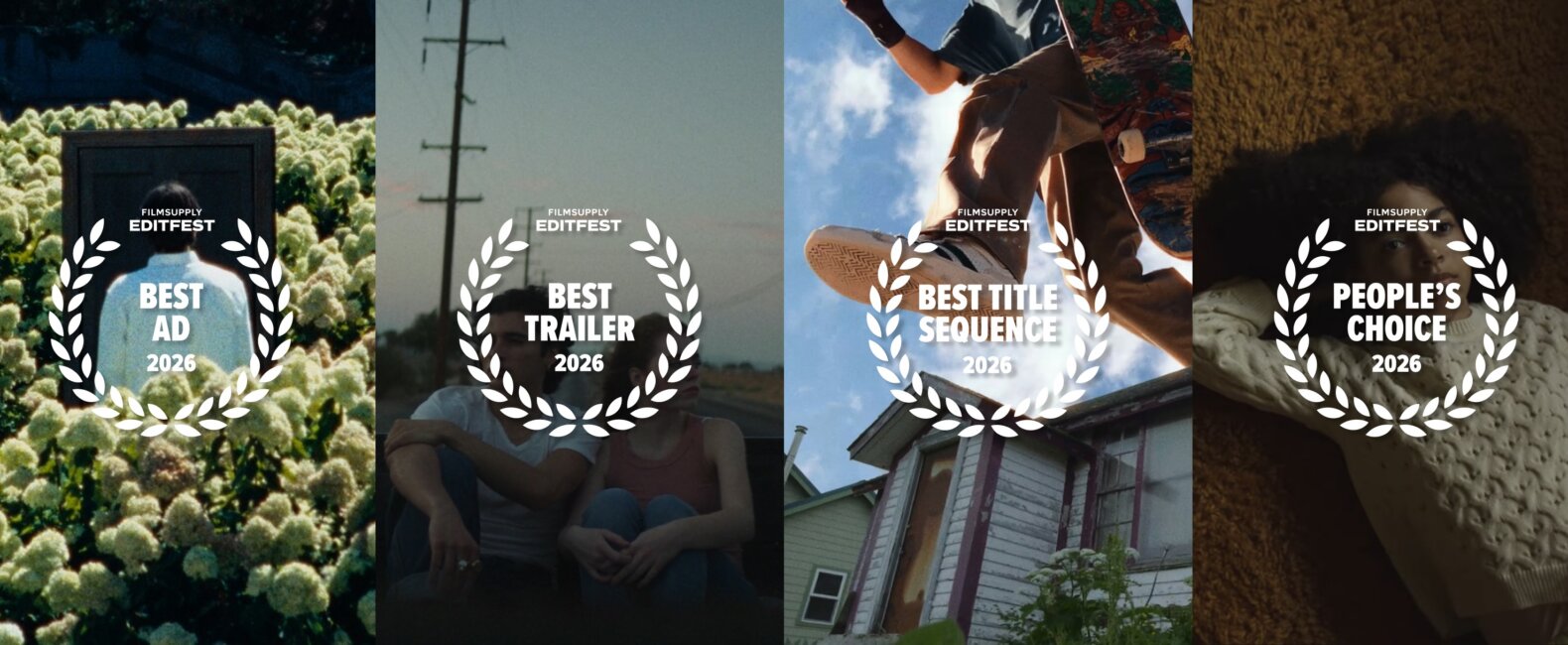
This round’s winners took Best Advertisement, Best Trailer, Best Title Sequence, and People’s Choice, and they’re splitting $70K+ in cash and prizes.
Here are the Editfest winners and the work that got them there.
FILMSUPPLY EDITFEST FALL 2026 WINNERS
BEST ADVERTISEMENT: “Doors” by Tim Kressin
CREDITS
Written and Edited by Tim Kressin – @timkressin
From Tim: Special thanks to my team who watched and gave notes – @wondercamp.co
JUDGES’ FEEDBACK
Eddie Kesler, Sr. Editor/VP at Company 3 | Coca-Cola, Delta Airlines, Google, Toyota
I really like this one. script is great. execution of the edit to match it is great. Good shot choices, and I love the pace and music. Very well done!
Alicia Shi, Director at Shi Creative Inc. | Michael Kors, Estée Lauder, Puma, Starbucks
I really enjoyed this piece! The technical execution is strong, and the story feels emotionally relatable. While the narrative structure of following different people’s experiences connected through a voiceover is something we’ve probably seen before, I love how the recurring metaphor of doors connects their lives.
There’s something really poetic about the idea that moving from one space to another can also mean moving from one emotional state to another. Simply opening a door and entering a room with someone you love can completely change how you feel. Doors become more than physical passages; they represent emotional transitions, new chapters, and all those moments in between.
We can recognize ourselves in these characters because most of us have experienced similar moments of transition. That emotional connection makes the concept especially effective for a therapy service advertisement. It’s thoughtful, relatable, and beautifully executed!
Oren John, Creator at Darkroom | Anthropic, Amazon, AMEX, Mazda
The concept and cinematography align well. It’s familiar and provoking, and the shot selection keeps it unexpected.
Logan Lambert, Director/DP | Red Bull, Ineos, Budweiser, JP Morgan Chase
Compelling concept and storytelling. I love the use of doors as a metaphor for life’s biggest changes and moments, and as a motif throughout. I like the copywriting and the shot selection here.
There is conflict and payoff throughout, with heavy and light moments, and the balance is great. Ending on the idea that the more you live, the more you go from one place to another, and a door is just the place to navigate the in-between, was nice. I loved the door of flowers as an image, but it asks the viewer to decode a metaphor in the last few seconds, and that’s where the message has to be clear.
I would have landed it in a literal sense, with an actual therapy session or a subject sitting in a room talking to a therapist. Give that moment room to breathe so the viewer can digest the ad and understand the payoff before it ends.
Other than that, I think the ad was great, and the shot selection, music, and copywriting were thoughtful.
BEST ADVERTISEMENT FINALISTS
BEST TRAILER: “Stay With Me” by Linus Johansson
CREDITS
Script and editing: Linus Johansson
Sound Design: Linus Johansson
Graphics and layout: Linus Johansson
VFX: Linus Johansson & Rajdarn Eldorado
JUDGES’ FEEDBACK
Adam Karp, Co-Producer at Stardust Frames | Netflix
The visuals are strong, and the editing is sharp. The use of title cards to help convey the story does a lot of heavy lifting and works great. It also pairs nicely with the voices present. The atmospheric visuals and the footage of people work well hand in hand. Overall, this is a very compelling trailer.
Ewurakua Dawson-Amoah, Director, Writer & VO Artist | IKEA, MTV, Lincoln Motors, Mastercard
So engaging!! Brilliant take on a concept we see often. Fresh and emotional. Not focusing on one character but on how this situation will affect the masses was a really interesting POV. Great image selections and a clear sense of worldbuilding in the color palette. The final image stays with you.
Dylan Heimbrock, Senior Producer at Droga5 | Microsoft, Bosch, GM, Alfa Romeo
I like the idea of people living their last day on Earth. But since there isn’t character consistency, it’s unclear if we are following just 1 couple, or if we’re following a bunch of people like an Altman film, on their last day on Earth.
Since the VO repeats the same phrase, to me, the implication is that it’s 2 people on their last day, but it’s not clear if that’s the case. This is a bit too much of a mood film at present, though a pretty good one. Would like to see fewer empty rooms during the “announcement” section, and larger groups of people.
Would also recommend re-thinking if this is an ensemble or if it would follow just two people.
The edit itself could be honed a bit better to drive whose last day this is once that’s rethought.
Dylan Knight, Director, Editor & Post EP | Nike, Apple, Paramount, Amazon Studios
Wow. So impressed by this one. I genuinely want to see this movie! Everything about this trailer worked for me. The shot selection was fantastic and established such a cohesive visual world that allowed every other element to land.
I especially loved the use of titles. The design felt so considered, beautifully integrated into the compositions, and perfectly in sync with the emotional builds.
The sound design was another standout. Those pockets of air where everything drops away to emphasize a moment were masterfully crafted. There’s so much confidence and restraint in those choices, and they made the bigger moments hit even harder.
Really impressive work. Every element felt intentional, and it all came together to create something incredibly compelling. Well done!
BEST TRAILER FINALISTS
BEST TITLE SEQUENCE: “Saints of Nowhere” by Ben Kadie
CREDITS
Editor/Animator: Ben Kadie / @ben_kadie
JUDGES’ FEEDBACK
Jane Qian, Freelance Director | Nike, Toyota, Google, Disney
Incredibly creative and gave a nice glimpse into what the film could be about. I love the surrealism of the floating whale in the sky and kid jumping over the house.
Taina Martinez, Supervising Producer at Harbor Picture, Co. | Apple, Ford, Adidas, Target
Absolutely loved the uniqueness of the title sequence. You could feel the heart of this piece and nostalgia, which is what folks are after these days. Sometimes, I felt it could be broken up a touch more to let some of it breathe before another dynamic cut. Letting the audience reveal in the emotion.
Shaun Morey, Producer at Group SJR | Spotify, Ford, Interac, ICG
I loved the attention to detail and the use of space throughout this piece. At a certain point, I felt like I was taken into the “Take On Me” music video, or at least reminded of how I felt when I first watched that classic with such a unique use of illustrations.
There was an incredible mix of that and live action, and I really enjoyed how each transition played with the two styles. Overall, this was a really cool piece, and I loved how playful and creative it was, and I know that was intentional to relate to the characters in the piece.
The symbolism was there; the transitions and the creativity throughout made this a really enjoyable piece to watch. I did find myself bouncing between a few different perspectives, particularly Sam and Lorenzo’s story moving to Saint August and that of the preacher and his son. I could see the connections being made, especially with the recurring symbolism of the butterflies across different scenes, which I really love to see.
I wasn’t always sure who I was meant to be following as the main character or where my focus should be, especially with Gigi getting the opening credit. That said, it’s pulling for a critique in an otherwise really, really strong piece.
I also loved the music and the consideration given to how it was used throughout the edit. Ultimately, I think this piece does exactly what it sets out to do: it makes me want to tune in, learn more about what’s happening in Saint August, and see how these characters navigate their story.
Lastly, this was my favorite of the submissions. It was incredibly original and so well done. It is such a unique and creative piece and deserves its props.
JK Carrington, Editor at Papercut | Microsoft, Mastercard, P&G Brands, Target
This was a well-done submission to show off technical skills! Content-wise and pacing fell a little short. The story wasn’t as compelling; there were a few moments where the shots/assets felt disjointed (for ex. the leap over the house isn’t as successful as it could be), and some parts felt a little slow. Could work better closer to a :45.
All the comps and animations were very well executed and fun.
BEST TITLE SEQUENCE FINALISTS
PEOPLE’S CHOICE: “THE WAKING” by Luke Trowbridge
CREDITS
Editor: Luke Trowbridge – @luke_kyle
JUDGES’ FEEDBACK
Adam Karp, Co-Producer at Stardust Frames | Netflix
The storyline isn’t the most clear in this piece, and perhaps that’s due to the casting of the voiceover. It doesn’t line up as much with the emotions and darkness the visuals and the themes of the story seem to want to convey. There are some strong edits and visuals on display, but the story could use a little bit more clarity.
Ewurakua Dawson-Amoah, Director, Writer & VO Artist | IKEA, MTV, Lincoln Motors, Mastercard
Hooked from the start. Exciting concept, beautiful introduction of characters and conflict, great scene selections, amazing score
Dylan Heimbrock, Senior Producer at Droga5 | Microsoft, Bosch, GM, Alfa Romeo
Overall, I found this a bit confusing. It starts with the daughter, and the car crash edit implies something traumatic happened to the family that’s causing her issues. But then it turns into a horror film that has a seemingly vague premise.
The idea of needing to stay awake to avoid the horror is fine (Nightmare on Elm Street) has made a billion dollars off it, but the VO says you need to stay awake to see the horrors. So are the people in the film being attacked IRL when they fall asleep? Or are they being tortured in their dreams and manifesting IRL like in Nightmare? If it’s the former, how would they know when something is has happened or that they need to stay awake for days to see the creatures?
I think the story needs to be made more clear on paper before revising the trailer as a whole.
Dylan Knight, Director, Editor & Post EP | Nike, Apple, Paramount, Amazon Studios
There was some really nice shot selection and restraint in the opening. I liked the space you gave those early moments, and there was a strong sense of atmosphere starting to build.
I found myself getting a little lost towards the middle. The narration was difficult to follow at times, and I wanted a bit more breathing room between lines of VO to let the visuals and emotions sink in. I also found the title design a little distracting. Its style felt at odds with the visual language of the piece, and a more cohesive approach could help everything feel like it’s part of the same world.
The sound design was a definite strength, and I could feel the intent behind what you were building. I think there’s an opportunity to bring that same level of intention to the pacing, narration, and overall visual cohesion to make the trailer more effective.